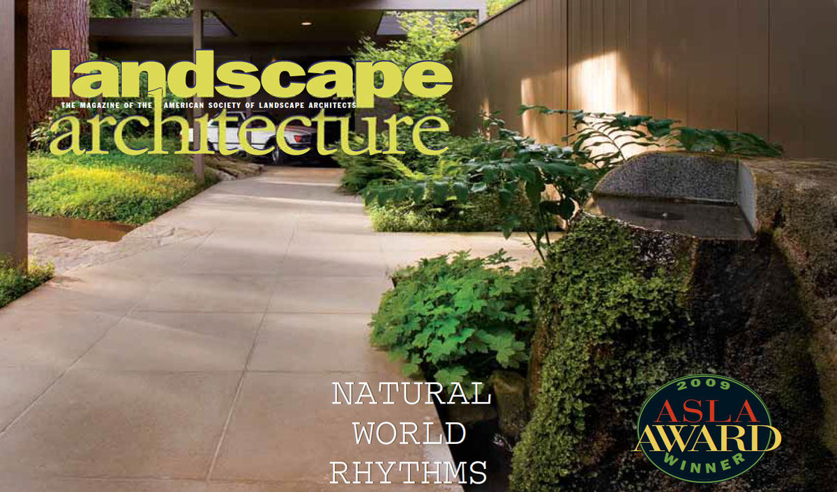

Natural World Rhythms
A mindful approach brings nature back to modernity.
AUTHOR: Landscape Architecture | 2009 November | PDF VERSION
Close to downtown Seattle on a one-acre parcel, the site forms part of the planned Hilltop Community, known for its modern structures and its serene, off-the-grid integration of house and site. Designed by architect John Detlie in 1950, the Hilltop Residence itself is archetypical of midcentury modern residential architecture. Broadhurst designed the complementing landscape to capture two moods: shadowy introspection on the entry side and sunlit expansiveness in the social / view area on the back.
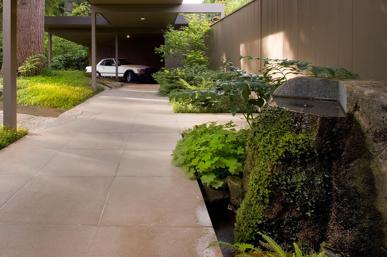
The “messy vitality” contrast shows up first on the entry side, evident in the treatment of the lush forest-floor ground plane, which is cut apart and spaced with the equally strongly expressed ground plane of custom pavers. A slow flow of water at the entry’s Wet Rock sculpture sustains the plush growth of moss and liverworts. Equally important, the entry’s ruggedly handsome, mature Douglas fir served as a starting point to connect the observer with a rhythm borrowed from the natural world, Broadhurst explains.
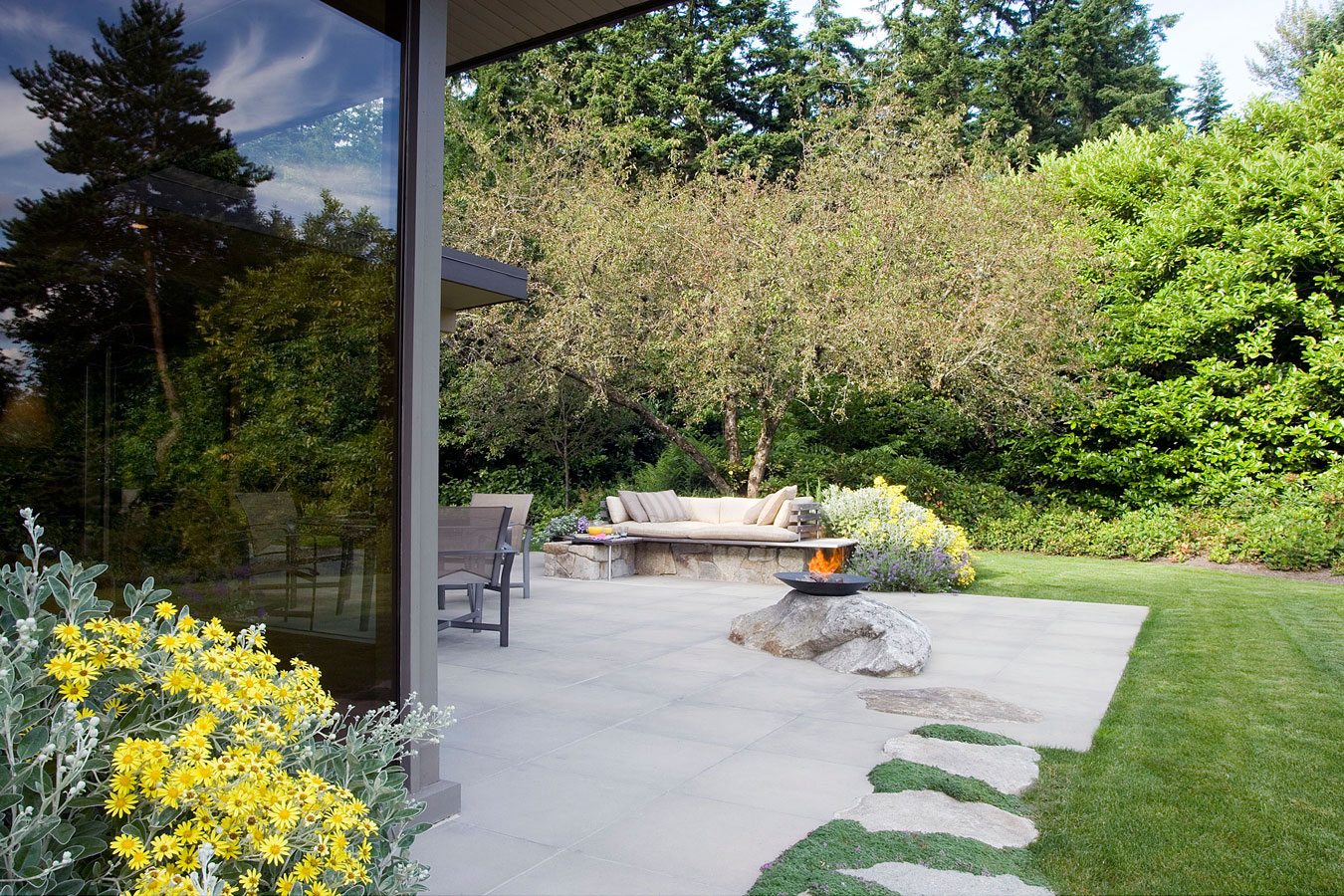
On the sunny south side, the spectacular views set the planting philosophy: With Mount Rainier for context, native and nonnative plants are massed for “an easy harmony, durability, and extended interest,” according to Broadhurst.
Broadhurst says the most challenging part of the project was “marshaling my thoughts into a message seductive and cogent enough to keep all parties involved with the project inspired and on track.” And it is the “small details with gravitas,” such as the texture of the liverworts and the moss in the front, that make him smile. He also is happy that he chose to emphasize the Douglas fir’s role in the design. “The Doug fir most likely was planted as a sapling by John Detlie, so I feel I connected to him and his intent,” he explains.

RESIDENTIAL DESIGN, Honor Award
MIDCENTURY MODERN HILLTOP RESIDENCE
Seattle, Washington
This project’s sleek, midcentury modern residence rests on the ground lightly and invites an earthy counterbalance from its landscape redesign. Facilitating privacy at the entry and maximizing mountain views from the living spaces, the slope of the building’s shed roof is lowest at the carport and expands to create the tallest ceiling heights at the view windows. With sensitive siting, the house appears modest in size but in actuality is considerably larger, because the studio is tucked beneath this level. The landscape architect engaged the architecture in more meaningful dialogue by giving coherency to the hardscape and landscape and expanding the terrace area so that it now reads as an extension of adjacent interior space. Two moods were emphasized: the shady introspection of the entry and the sunlit expansiveness of the social view area. The jurors called this project “the real deal, with little inventive surprises and moves.”


