Urban Oasis
A tiny postage stamp of space had two big things going for it: multiple vantage points from which to view it and two clients excited by the creative process of improving it.
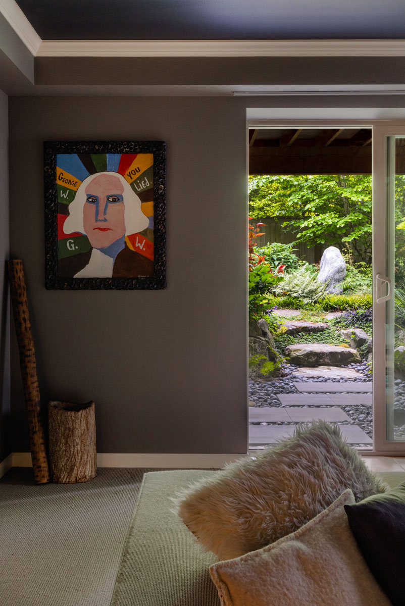
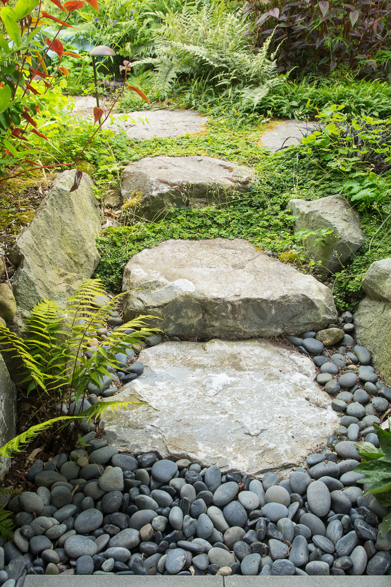
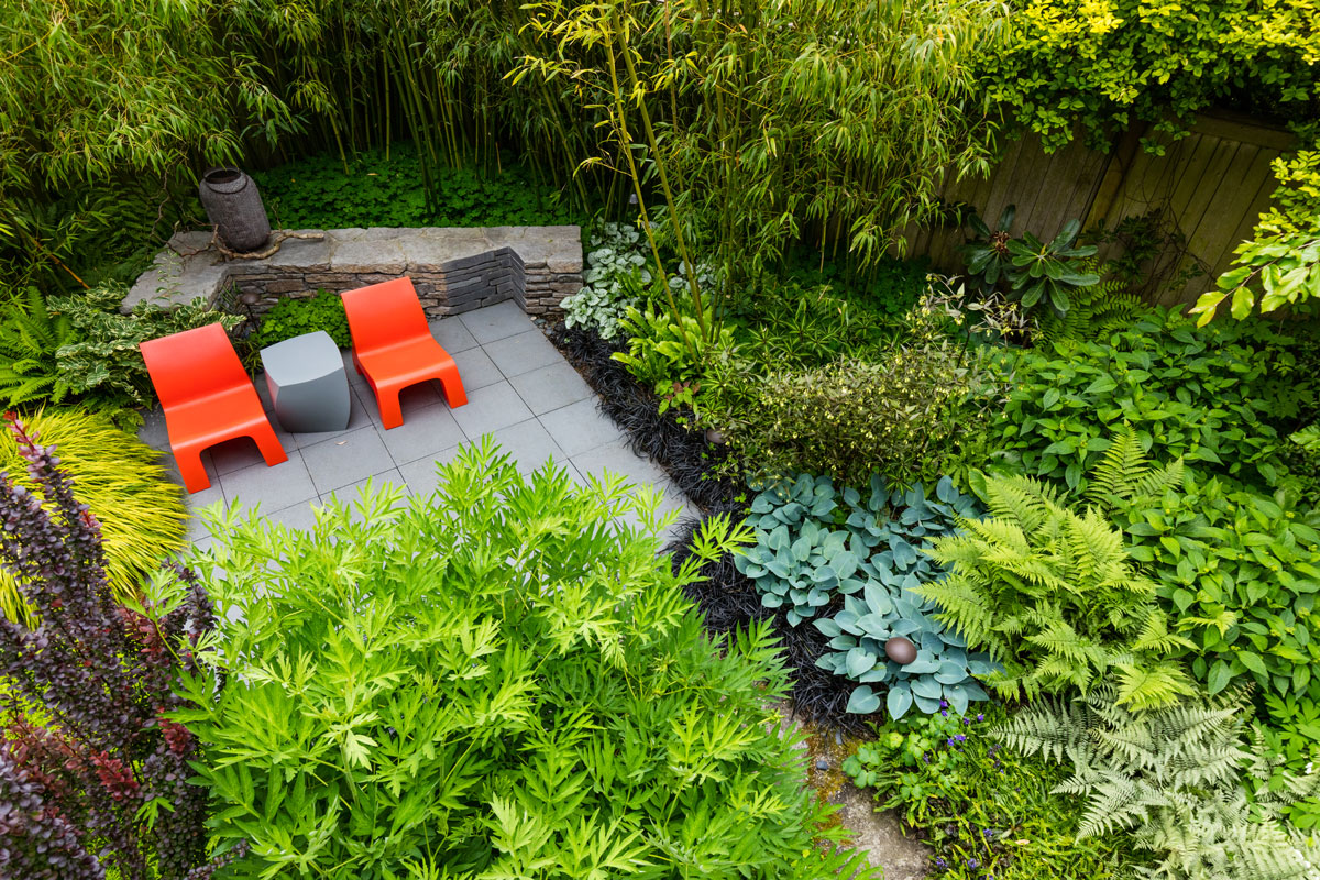
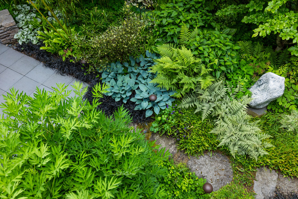
The design focused on creating visual clarity from three angles: a small Master Bedroom deck acts as an aerie with the broadest vantage point; basement access provides something akin to a grotto with the enjoyment of details at soil level, and, at mid-level between the two, the Main Deck used for dining.
Altogether, this was a space with enormous untapped potential.
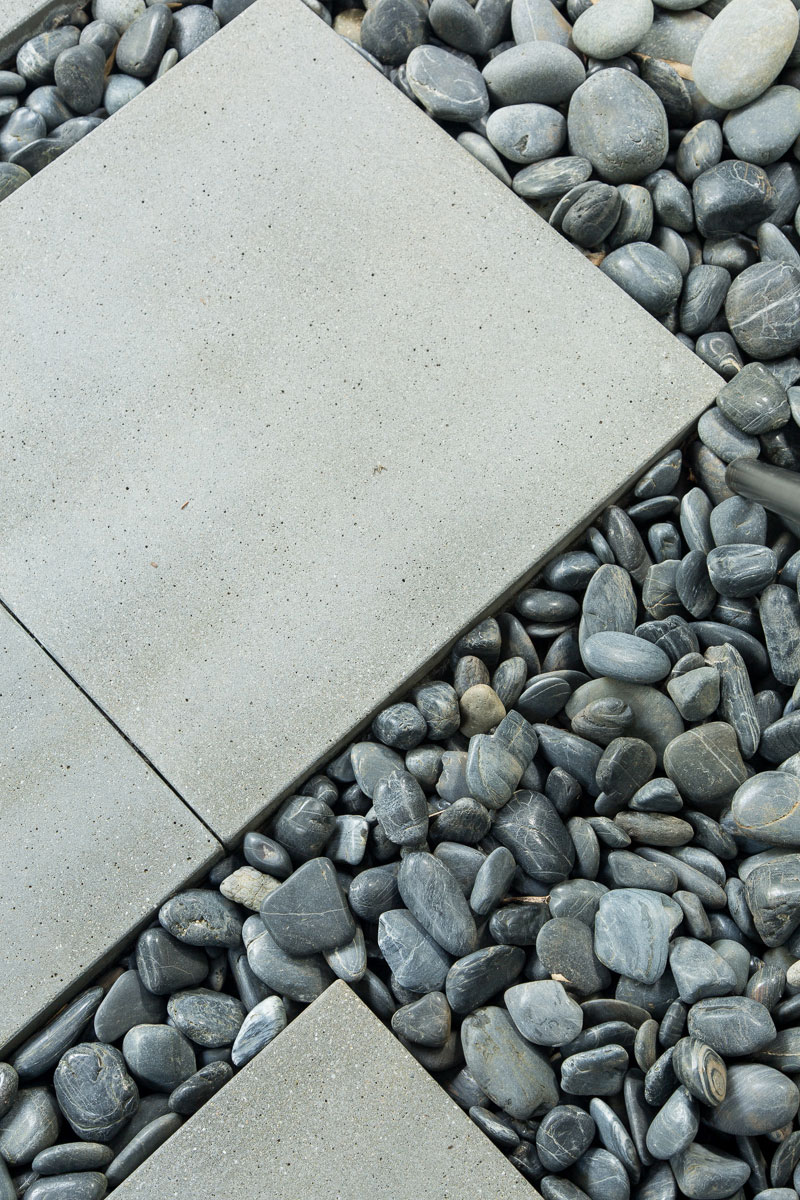
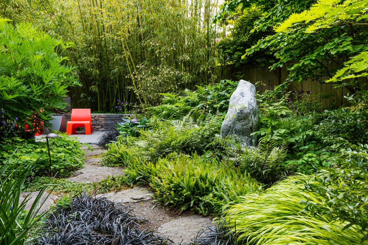
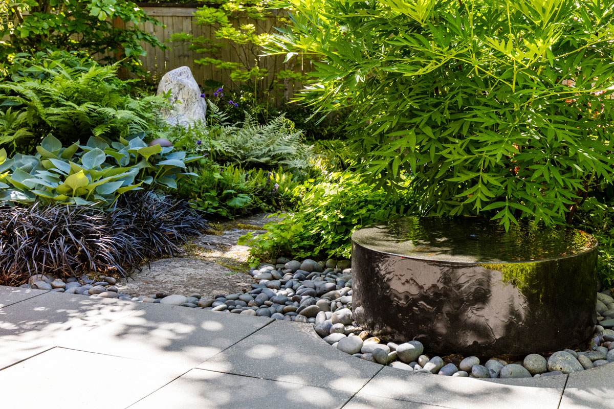
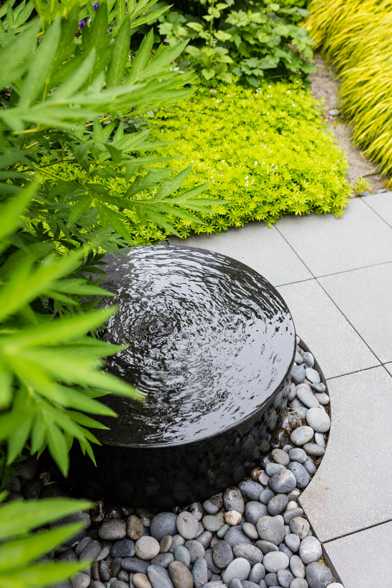
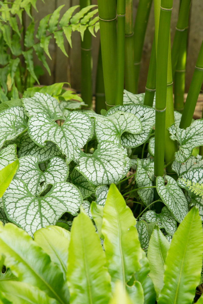
These levels, now enhanced and improved, visually interact with a square patio and a stone sitting wall, both placed askew. This playful offset creates a graphic/spatial tension within the space. Plants are a foil to this, deployed to provide lush organic textures and patterns. Carefully chosen sculptural elements further strengthen desired sight-lines.
There is a fun, easy logic to how the owners use and enjoy the space; their activities on multiple levels animate the design and add further interest.
To See More About Urban Oasis
Green Ramblings
A blog. A running series of Paul Broadhurst’s website articles.
Press + Media
A collection of publications about our project work can be found here.

Leafing Out
We have selected an article about this project for you.

